从「我喜欢你」到一座不存在的小邮局From “I like you” to a post office that doesn't exist yet
一次关于语言、情绪、交互设计与数字明信片的浪漫实验:从收集 32 种语言的「我喜欢你」,到把表达的主动权交还给使用者。A romantic little experiment about language, mood, interaction design and digital postcards: from collecting “I like you” in 32 languages to handing the power of expression back to the writer.
- AFTERWORDS
- 交互设计
- 数字明信片
- AI 辅助创作
- 产品迭代
- AFTERWORDS
- Interaction Design
- Digital Postcard
- AI-Assisted Creation
- Product Iteration
一次关于语言、情绪、交互设计与数字明信片的浪漫实验。
01 / 一个有点浪漫的念头
最开始,我只是突然有了一个想法:
如果把世界上不同语言的“我喜欢你”放在同一个地方,会是什么样子?
中文的“我喜欢你”,英语的“I like you”,日语的「好きです」。
不同的文字、发音、语法,以及不同文化中表达情感的方式。
我觉得这是一件很有趣的事情。
同样是表达喜欢,有些语言的说法直白,有些表达委婉;有些词句需要结合语境才能理解,也并不是所有语言都能和中文的“喜欢”或“爱”一一对应。
我想把它们收集起来。
但又不希望只是做一个翻译词典。
如果这些文字能在屏幕里自由漂浮呢?如果鼠标靠近时,它们会轻轻躲开、聚拢,或者回应我的触碰呢?
于是,我开始构想一个可以探索的文字宇宙。
我给这个实验起了一个名字:AFTERWORDS。
那些还没说出口的、已经说过的,或者想了很久却不知道该怎么表达的话,都可以在这里找到一个位置。
02 / 让文字变得可以触碰
第一阶段,我把注意力放在了文字交互上。
我希望打开网页时,用户看见的不是整齐排列的语言列表,而是一片由不同文字组成的空间。
文字可以漂浮,可以被拖动。当鼠标靠近时,它们会像受到某种微弱的引力一样产生变化。
点击其中一句,其他文字逐渐退到背景里,被选中的表达则成为视觉中心。
随后,用户可以了解它的含义、读音和使用语境,再把它带进一间小小的情书工作室。
这个想法逐渐形成了 AFTERWORDS v0.2。
在设计过程中,我也重新思考了之前学习过的一些 UI 概念。
比如,动画到底是用来装饰页面,还是帮助用户理解当前发生了什么?
一段好看的动态字体,不一定意味着好的交互。
如果鼠标移过去,只是出现更多光效,用户可能觉得新鲜,却未必知道接下来能做什么。
所以我尝试让动画和操作产生联系:
触碰,是探索;聚焦,是选择;文字落入信纸,是从发现走向创作。
我希望动效不只是展示技术,而是让用户感受到自己的行为正在改变这个空间。
当然,这只是设计假设。真正的交互是否直觉、是否有趣,还需要更多实际使用反馈来判断。
03 / 一封漂亮,但还不够特别的信
v0.2 不只有文字宇宙。
我还为它设计了情书卡片:选择一种语言,填写姓名,再把这句话保存成一张图片。
一开始,我很喜欢这个方向。
不同语言的文字配上精致的排版、纸张纹理和星夜背景,确实很浪漫。
但继续观察后,我开始觉得哪里还不够。
当两张情书卡片只是改变了颜色和背景,而文字结构基本相同时,它们看起来依然像同一张模板。
更重要的是,用户能表达的内容太有限了。
即使提供几十种语言,最后也仍然围绕着“我喜欢你”这一个句子展开。
于是,我开始思考:
为什么一定要写“我喜欢你”?
如果我只是想说一句“很高兴见到你”呢?
如果我想谢谢一个帮助过我的人呢?
如果我想把今天的某个瞬间留给未来的自己呢?
有些情绪其实没有那么明确的名字。
它可能不是爱情,也不是友情,只是一种想要表达的心情。
这让我意识到,最初的设计或许限制了这个实验可以承载的内容。
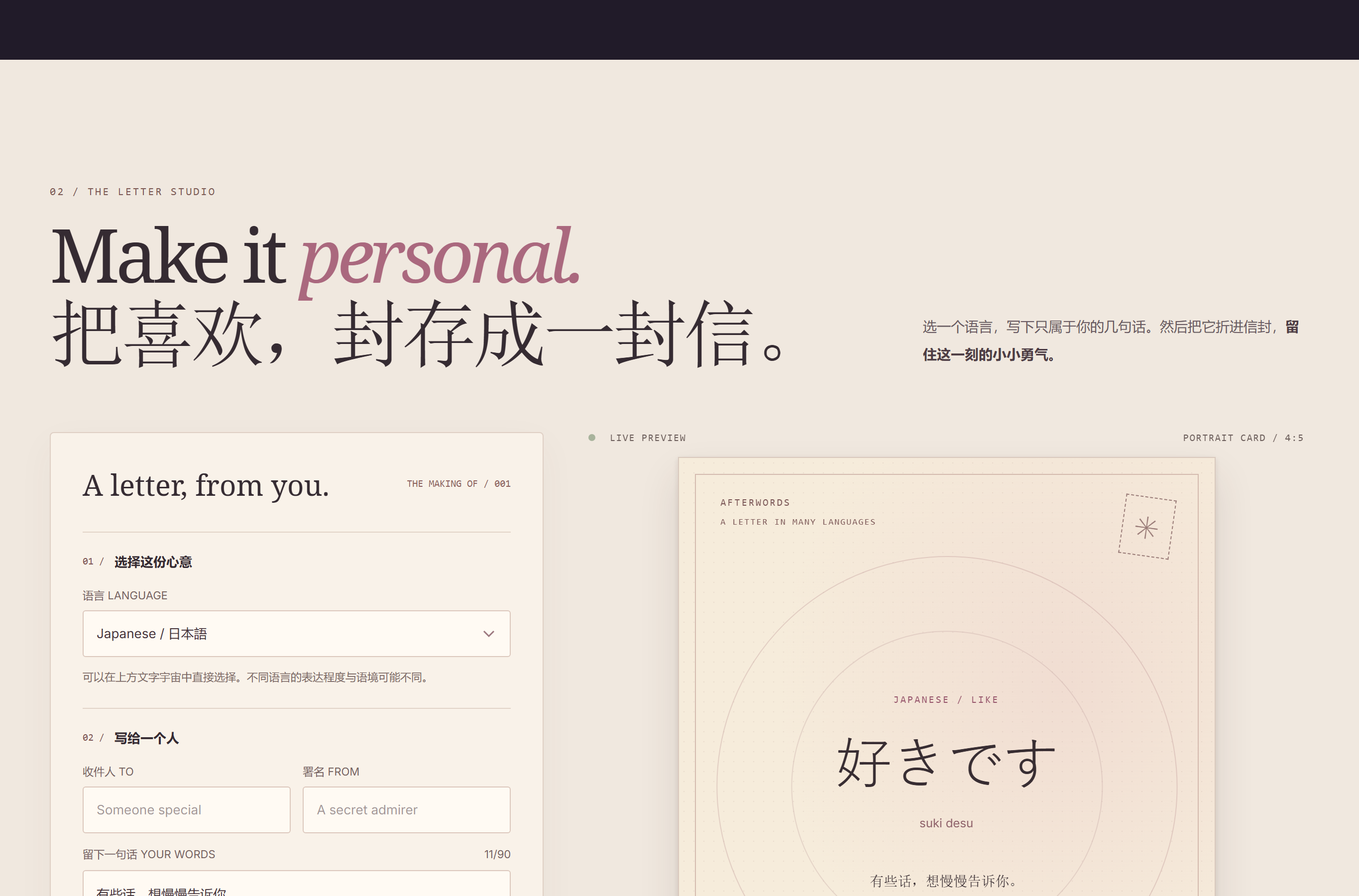
v0.2 的情书工坊:语言决定了卡片的主角,一切围绕「我喜欢你」这一个句子展开。
04 / 从情书到明信片
于是,AFTERWORDS v0.3 的方向发生了改变。
原本的语言展示被保留下来,但它不再是唯一的创作入口。
用户可以从现有短句中寻找灵感,也可以完全自由地写下自己的话。
而情书卡片,逐渐变成了可以编辑正反面的数字明信片。
我为它尝试了三种不同的视觉风格。
旧日邮局,带有奶油色纸张、邮政边框和复古邮戳,像一张经过时间沉淀的纸质明信片。
星际电报,使用深色星空、行星轨道和柔和的光,像一封从遥远宇宙寄来的消息。
剪贴日记,则更自由、轻松,使用纸张拼贴、胶带和不同字体,把一句话变成手账里值得留下的一页。
我不想让它们只是同一种布局的三个配色方案。
不同的视觉风格应该具有不同的情绪和叙事方式。
明信片也开始有了正反面。
正面可以是一句短短的话,背面则留给收件人、留言和署名。
写完之后,用户可以将它封存,再打开、查看和保存。
这一版本还不是真正意义上的在线邮局。它暂时不能直接把明信片寄送到另一个人的网页里,但已经可以生成图片,通过其他方式分享。
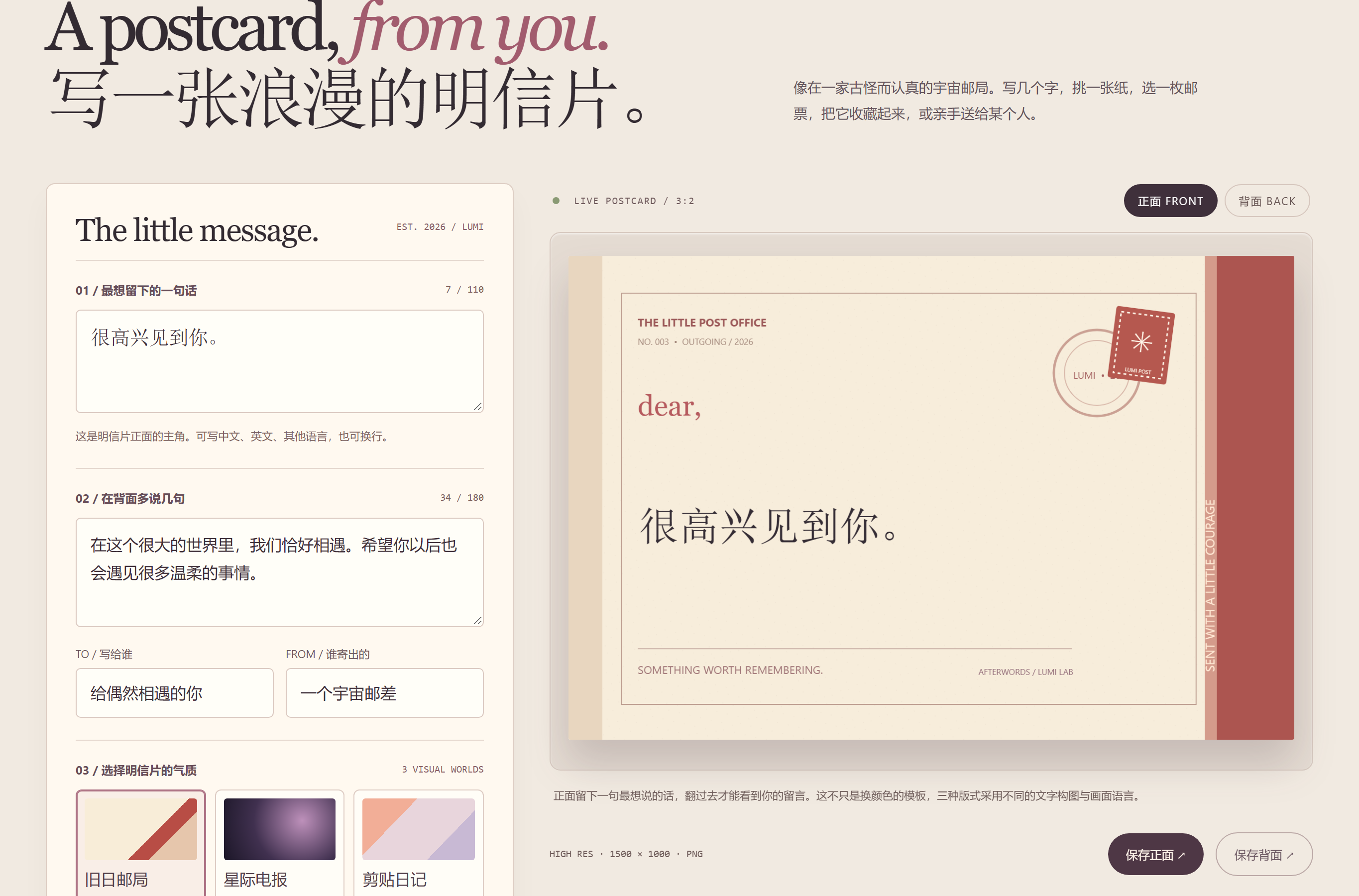
v0.3 的明信片工坊:文字可以完全自己写,正面与背面各有各的构图。
从 v0.2 到 v0.3,我最大的改变,不是增加了多少功能,而是把表达的主动权更多地交还给了使用者。
最开始,我想展示不同的人怎样说“喜欢”。
后来,我开始希望每个人都能在这里说自己真正想说的话。
05 / 关于 AI 辅助创作的一点记录
这次实验依然主要借助 AI 编程工具完成。
我的工作更多集中在提出想法、讨论交互、判断视觉方案、体验原型,以及不断修改那些不符合预期的地方。
我不是一个能够独立完成所有前端实现的专业开发者。
但我正在学习如何把一个模糊的念头,拆解成可以被实现、可以被体验,也可以继续修改的产品。
这次让我印象比较深的,是视觉效果和实际使用之间的差距。
比如,文字在桌面端看起来很有趣,放到手机端就可能变得拥挤。
短句在明信片里排版很好看,但用户自己输入一段长文字时,字号、换行和布局都需要重新考虑。
甚至还有一次,HTML 文件已经生成了,却没能通过最初提供的方式顺利打开。
这些问题一点也不浪漫。
但它们同样是产品的一部分。
毕竟,一个网页看起来完成了,不代表它已经可以被别人顺利使用。
AI 可以帮助我加快实现速度,也可以提供设计和技术方案,但它并不能自动决定一个交互是否有意义、一张卡片是否足够动人,或者一个功能是否真的需要存在。
这些判断仍然需要在一次次尝试中形成。
而我也越来越觉得:
能快速做出一个东西很重要,但知道为什么要做、哪里做得不好、接下来应该改什么,同样重要。
06 / 为什么我们还需要一张明信片?
做这个实验的时候,我也有过一个疑问:
现在交流已经这么方便了,为什么还要费心制作一张明信片?
我们可以随时发送微信消息。
一句祝福可以直接复制粘贴,一段复杂的感情也可以交给 AI 帮忙润色。
信息传递越来越容易。
但表达心意,似乎并没有因此变成一件完全简单的事。
有时候,我们会为了一个人认真选择措辞。
有时候,只是想给某句话挑一个合适的字体,找一种能表达当下心情的颜色。
也许最终寄出的内容只有短短几个字。
但选择、修改、犹豫和制作的过程,本身也可能是表达的一部分。
我不觉得数字明信片能够替代真实的书信,也不认为所有情感都需要仪式感。
只是偶尔,我希望那些平时一闪而过的话,能够有一个值得停留的地方。
这也是我想继续做 AFTERWORDS 的原因。
07 / 一座尚未建成的小邮局
目前,AFTERWORDS 还只是一个不断变化的网页实验。
它有可以触碰的文字宇宙,有不同语言的表达,也有一间能够制作明信片的小工作室。
但还有很多地方值得继续完善。
比如,如何让不同语言的文字展示更加准确、自然?怎样设计更自由、又不至于复杂得像专业设计软件的卡片编辑器?如果未来可以真正寄送数字明信片,又应该怎样处理链接、隐私和保存期限?
这些问题我还没有最终答案。
我也不急着给它定义一个完整的商业模式。
它可以先是一件小而有趣的作品。
一个用来学习交互设计、练习产品判断、探索文字和情绪关系的地方。
如果未来真的有人用它制作了一张卡片,寄给朋友、喜欢的人,或者几年后的自己,那应该会是一件很有意思的事情。
不过现在,我更愿意把它看作一座尚未建成的小邮局。
这里不一定寄爱情。
也可以寄祝福、感谢、思念、勇气,或者一句没有特别理由的问候。
我不知道这座小邮局最终会变成什么样子。
但我希望,它能够一直保留最初那个有点天真的念头:
世界上有那么多种表达,我们总能找到一种方式,把想说的话留下来。
AFTERWORDS 是一个持续迭代中的个人网页实验。目前保留 v0.2 文字宇宙与情书版本,以及 v0.3 浪漫明信片版本。项目主要借助 AI 辅助编程完成,仍在持续完善交互、语言内容与分享体验。
A romantic little experiment about language, mood, interaction design and digital postcards.
01 / A somewhat romantic idea
It started with a sudden thought:
What would it look like if “I like you” in different languages lived in the same place?
Chinese “我喜欢你”, English “I like you”, Japanese「好きです」.
Different scripts, pronunciations, grammar, and different ways for cultures to express affection.
I found that a fascinating idea.
Some languages say “like” directly, some indirectly; some phrases only make sense in context, and not every language maps neatly onto the Chinese “喜欢” or “爱”.
I wanted to collect them.
But I didn’t want to build a translation dictionary.
What if these words could float freely on the screen? What if, as your cursor came close, they would gently drift away, gather, or respond to your touch?
So I started imagining an explorable universe of words.
I gave the experiment a name: AFTERWORDS.
The things not yet said, the things already said, the things you have thought about for a long time without knowing how to express — all of them could find a place here.
02 / Making words touchable
In the first stage, I focused on the interaction with words themselves.
When you opened the page, I didn’t want a neatly arranged list of languages — I wanted a space made of words.
Words could float, and they could be dragged. As your cursor approached, they would shift as if pulled by some faint gravity.
Click one sentence and the others recede into the background, while the chosen expression becomes the visual center.
Then you could learn its meaning, pronunciation and context, and carry it into a tiny letter studio.
This idea gradually became AFTERWORDS v0.2.
While designing it, I also revisited some UI concepts I had learned before.
For example: is animation decoration, or does it help people understand what just happened?
Beautiful moving type does not automatically mean good interaction.
If hovering only produces more glow, it may feel fresh — but users still might not know what to do next.
So I tried to tie motion to action:
Touching is exploring; focusing is choosing; a word settling into the paper is the move from discovery to creation.
I wanted the motion to show that your behavior is changing this space — not to show off technique.
Of course, that was only a design hypothesis. Whether the interaction is truly intuitive and fun still needs real feedback to judge.
03 / A beautiful letter, but not a special one yet
v0.2 was more than the word universe.
I also designed love-letter cards: pick a language, fill in a name, and save the sentence as an image.
At first, I loved this direction.
Different languages set in careful typography, paper texture and a starry background — it really was romantic.
But as I kept looking, something felt missing.
When two letter cards only changed color and background while the text structure stayed the same, they still looked like the same template.
More importantly, there was very little the user could actually express.
Even with dozens of languages, everything still revolved around that one sentence, “I like you”.
So I started asking:
Why does it have to be “I like you”?
What if I just wanted to say “Nice to meet you”?
What if I wanted to thank someone who helped me?
What if I wanted to keep a moment from today for my future self?
Some feelings don’t have a clear name.
They might not be romance, or friendship — just a mood that wants to be expressed.
That’s when I realized the original design might have limited what this experiment could hold.
The v0.2 letter studio: the language decided the card’s protagonist, and everything revolved around “I like you”.
04 / From love letters to postcards
So AFTERWORDS v0.3 changed direction.
The language collection stayed, but it was no longer the only entry point for creation.
You could look for inspiration in the ready-made phrases, or write something entirely your own.
And the letter card gradually became a digital postcard with an editable front and back.
I tried three different visual styles for it.
The Old Post Office — cream paper, postal borders and a vintage postmark, like a paper postcard aged by time.
The Night Telegram — a dark starry sky, planetary orbits and soft light, like a message sent from far across the universe.
The Scrapbook — freer and lighter: paper collage, tape and mixed typefaces, turning one sentence into a page worth keeping in a journal.
I didn’t want them to be three color schemes of the same layout.
Different visual styles should carry different moods and different ways of telling a story.
The postcard also grew two sides.
The front holds one short sentence; the back is left for the recipient, the message and the signature.
When you finish, you can seal it, then open it again, look at it, and keep it.
This version is still not a real online post office. It cannot yet deliver a postcard to another person’s page — but it can already generate an image you can share in other ways.
The v0.3 postcard studio: the words can be entirely your own, and each side gets its own composition.
The biggest change from v0.2 to v0.3 was not the number of features — it was handing more of the power of expression back to the person using it.
At first, I wanted to show how different people say “like”.
Later, I wanted everyone to be able to say what they actually wanted to say.
05 / A note on AI-assisted creation
This experiment was still built mainly with AI coding tools.
My own work was mostly proposing ideas, discussing interactions, judging visual directions, experiencing prototypes, and repeatedly fixing whatever didn’t match my expectations.
I am not a professional front-end developer who can independently implement everything.
But I am learning to take a vague idea and break it into something that can be built, experienced, and continued to be revised.
What struck me this time was the gap between how things look and how they actually get used.
For example, floating words look delightful on desktop but can turn crowded on a phone.
A short phrase typesets beautifully on a postcard, but when users type their own long message, the font size, line breaks and layout all need rethinking.
Once, the HTML file had even been generated but couldn’t be opened through the delivery method it was first provided with.
None of this is romantic.
But it is part of the product all the same.
A page that looks finished is not the same as a page other people can actually use.
AI can speed up implementation and propose design and technical solutions, but it cannot decide by itself whether an interaction is meaningful, whether a card is moving enough, or whether a feature needs to exist at all.
Those judgments still have to form through attempt after attempt.
And I increasingly feel:
Building something quickly matters, but knowing why you built it, where it falls short, and what to change next matters just as much.
06 / Why do we still need a postcard?
While building this, I had a question of my own:
Messaging is so convenient now — why bother making a postcard at all?
We can send a WeChat message at any moment.
A blessing can be copy-pasted; a complicated feeling can be handed to AI for polishing.
Transmitting information keeps getting easier.
But expressing care has not become entirely simple because of it.
Sometimes we choose our words carefully for one specific person.
Sometimes we just want to pick the right typeface for a sentence, or a color that matches the mood of the moment.
Maybe what finally gets sent is only a few characters.
But choosing, revising, hesitating and making are themselves part of the expression.
I don’t think a digital postcard replaces a real letter, and I don’t believe every emotion needs ritual.
It’s just that once in a while, I want the words that flash through our minds to have a place worth staying in.
That’s why I want to keep working on AFTERWORDS.
07 / A little post office not yet built
For now, AFTERWORDS is still a constantly changing web experiment.
It has a touchable universe of words, expressions in different languages, and a small studio for making postcards.
But there is still a lot worth improving.
How can the display of different languages be made more accurate and natural? How do you design an editor that stays free without becoming as complex as professional design software? If digital postcards could truly be delivered someday, how should links, privacy and expiration be handled?
I don’t have final answers to any of these.
And I’m in no rush to define a complete business model for it.
It can start as a small, interesting piece of work.
A place for learning interaction design, practicing product judgment, and exploring the relationship between words and feelings.
If someday someone actually uses it to make a card and send it to a friend, someone they like, or to themselves a few years from now — that would be a lovely thing.
For now, I’d rather see it as a little post office not yet built.
It doesn’t have to carry only love.
It can carry blessings, gratitude, longing, courage, or a greeting with no particular reason at all.
I don’t know what this little post office will eventually become.
But I hope it keeps its first, slightly naive thought:
There are so many ways to say things — we can always find one that keeps our words safe.
AFTERWORDS is an ongoing personal web experiment. It currently keeps the v0.2 word-universe and letter version, and the v0.3 romantic postcard version. The project is built mainly with AI-assisted coding, and its interactions, language content and sharing experience are still being refined.
dear reader,
很高兴在这里
遇见你。
这张明信片可以在正反面之间翻动——就像这篇文章里的两个版本,都还在线。