从像素级复刻到风格蒸馏:一个 UI Skill 是怎样被做出来的From Pixel-Perfect Cloning to Style Distillation: How a UI Skill Was Built
一次把模糊审美变成可复用设计规则的实验:从像素级复刻到风格蒸馏,再到 Style Lab 与截图验收。An experiment in turning vague taste into reusable design rules — from pixel-perfect cloning to style distillation, a Style Lab, and screenshot-based acceptance.
- UI 设计
- AI 编程
- Skill
- 设计系统
- 人机协作
- UI Design
- AI Coding
- Skill
- Design Systems
- Human-AI Collaboration
一次关于审美、产品决策与 AI 协作的真实实验。
01|我只是想让 AI 把网页做得更好看一点
事情的开始其实很简单。
我一直喜欢收集一些设计得很好看的网站。
Apple、Google、Stripe、Vercel、Linear……
有些网站的布局很舒服,有些字体和间距处理得恰到好处,还有一些页面,即使没有特别复杂的动画,也能给人一种很完整的视觉体验。
我经常会把这些网站作为参考,保存截图、记录设计资源,或者在开发自己的网页时,把链接交给 AI。
然后告诉它:
我想要类似这样的风格。
但实际效果并不总是理想。
有时 AI 能够理解我想要的整体方向,却在细节上出现偏差。
我喜欢参考网站的布局,它却重新设计了一套结构;我希望页面保持统一的视觉比例,它却在不同区域使用了不一致的间距;我希望它尽可能还原某种视觉效果,最后得到的却是一个看起来有些相似、但又完全不是我想要的页面。
问题似乎出在 AI 对设计要求的理解上。
「简洁一点」「高级一点」「更有科技感」这些描述太模糊了。
即使提供参考网站,AI 也未必能够准确理解其中的视觉关系。
所以,我最初的想法其实非常直接:
能不能让 AI 尽可能按照我喜欢的网站进行像素级复刻?
我希望它能够准确还原参考网站的布局、比例、颜色、字体和组件关系。
这样一来,页面的视觉结构会更加稳定,也更容易呈现出我真正喜欢的效果。
我当时并没有想太多关于设计系统的事情。
我只是希望,下一次让 AI 帮我开发网页时,不必每次都从头解释自己的审美。
02|为什么不直接复刻?
2026 年 6 月 10 日,我们开始正式讨论这个想法。
我提出希望建立一个可以在 AI 编程过程中调用的 UI Skill。
最初的目标包括:
- 收集自己喜欢的网站作为设计参考。
- 提取不同网站的视觉风格。
- 保存字体、颜色、布局和组件等信息。
- 在后续开发时调用对应的风格。
- 尽可能保持页面视觉效果的一致性。
我最初倾向于像素级复刻。
从我的角度来看,这是一种相对直接的解决方案。
既然我喜欢某个网站的设计,那就尽可能让 AI 还原它。
但 AI 提出了不同的看法。
如果只是复刻一个网站,可能会遇到几个问题。
首先,不同网站的设计往往与自身的品牌、内容和业务场景紧密结合。直接复制某个网站的布局和视觉表达,并不意味着能够适用于其他产品。
其次,像素级复刻需要持续维护。参考网站一旦发生变化,原来的实现可能就需要重新调整。
还有一个问题:如果每次都依赖完整复制某个网站,那么我们得到的可能只是一个个独立的仿制页面,而不是能够反复使用的设计能力。
AI 提出了另一个方向:
与其复制一个完整网站,不如提取它的设计规律。
例如:
- 它使用什么样的字体层级?
- 页面如何安排留白?
- 标题与正文之间是什么关系?
- 色彩如何形成主次?
- 卡片、按钮和导航采用什么样的视觉语言?
- 它如何处理桌面端和移动端的布局?
这些内容可以被整理成一套设计规则,再应用到不同的项目中。
我们最终选择了一个折中方向:不追求对原网站进行像素级克隆,而是追求较高的审美相似度,保留具有辨识度的视觉特征,同时允许根据新项目的实际需求调整布局。
这并不是说最初的想法没有价值。
相反,我仍然认为视觉还原度非常重要。
只是我们开始意识到,稳定的视觉效果不一定只能通过复制一个页面获得。
我原本希望 AI 记住一个网站长什么样,后来我们开始尝试让它理解一个网站为什么会呈现出这样的视觉效果。
这是整个项目第一次比较明显的方向变化。
03|我们决定把它做成一个 Skill
方向确定之后,项目开始从一个想法变成具体的工程任务。
我们将它命名为 UI Style Distiller。
它的核心目标是:帮助 AI 编程工具识别、提取、保存和复用网站的视觉风格。
我希望它不只是一个存放设计参考的文件夹。
如果每次使用时还需要重新向 AI 解释所有规则,那它并没有真正解决我的问题。
所以,我们开始设计一套可以被 AI 开发工作流调用的结构。
大致分成几个部分:
第一,风格分类。
将不同网站的视觉特征整理成相对独立的风格配置。
例如 Apple-like、Google-like、Stripe-like 等。
这些名称主要用于识别参考方向,并不意味着要复制对应品牌的完整网站。
第二,风格卡。
把颜色、字体、布局、间距、组件、视觉密度等信息整理成可以重复调用的配置。
第三,URL 风格蒸馏。
允许用户提供参考网站,尝试从网页中提取设计信息。
第四,开发时调用。
在创建新页面时,根据项目需求选择对应风格,将规则应用到实际页面。
第五,截图检查。
页面生成之后,不只依靠 AI 自己判断是否美观,而是通过实际截图检查布局和视觉问题。
这套流程逐渐形成了项目的基本结构。
不过,我们很快又遇到了一个新问题。
如果用户只能通过修改文件和命令来选择风格,那么这个 Skill 对普通使用者来说仍然不够直观。
我希望能够直接看到不同风格的效果,再进行选择。
于是,项目又发生了一次扩展。
04|我想要的不只是一个文件夹,而是一个可以操作的 Style Lab
2026 年 6 月 10 日晚上,我们继续讨论了项目的交互方式。
AI 提出了三个方向:
- Style Lab:集中展示和选择不同风格。
- Demo Gallery:展示不同风格的页面效果。
- Full App:进一步发展为完整的可视化设计工具。
我最终选择了 Style Lab。
原因也很简单。
我希望能够直观地比较不同风格,而不是只看一堆配置文件。
后来,我们为它增加了交互式展示页面。
初版包括七种风格、三种产品场景、视觉密度选择,以及可以复制的 Style Brief。
用户可以选择不同风格和场景,观察页面的视觉呈现,再将选定的设计要求交给 AI 开发工具使用。
这个过程让我觉得,项目开始变得有意思了。
它不再只是一个帮助 AI 提取网页设计信息的工具,而是逐渐拥有了一个可以让人直接参与选择的界面。
这里也有一个值得说明的地方。
Style Lab 的交互需求和方向选择是我提出并确认的,但具体的 HTML、CSS 和页面实现主要由 AI 辅助完成。
我负责的是需求、功能方向和体验判断,AI 则承担了大量具体实现工作。
这也是我当时使用 AI 编程工具的一种典型方式。
我不一定能够独立完成所有工程实现,但我可以参与决定产品应该做什么、怎样组织功能,以及最终的效果是否符合预期。
当然,这并不意味着我已经掌握了这些功能背后的全部技术。
05|页面看起来不错,真的代表它做好了吗?
随着 Demo 越来越完整,我们开始进行截图检查。
这一步让我印象很深。
因为在实际测试之前,有些问题很容易被忽略。
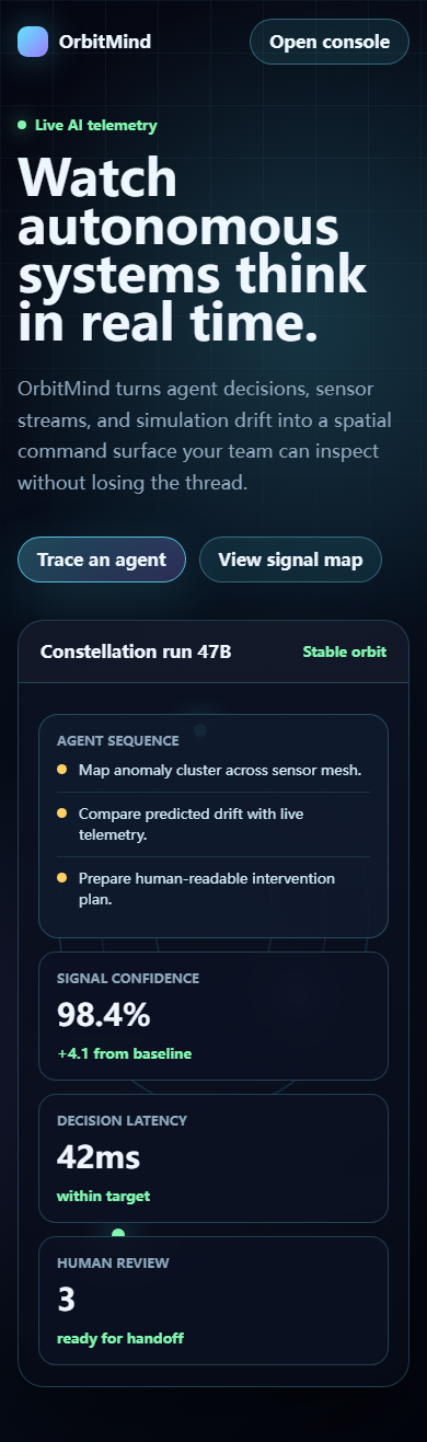
例如,Futuristic AI Demo。
在桌面端,它的布局看起来没有明显问题。
但切换到移动端之后,任务列表和遥测面板之间出现了遮挡。
原本应该清晰排列的内容,因为空间不足而发生了重叠。
后来,我们调整了移动端的布局方式,将部分内容改为流式堆叠,让不同面板能够按照屏幕宽度重新排列。
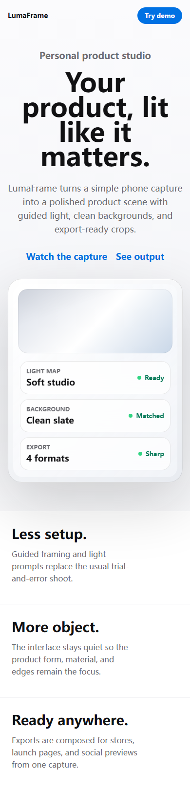
另一个案例是 Apple-like 产品展示页面。
它也保留了移动端截图与验收报告,用来检查设备预览和控制卡片在窄屏下的排布。
下面是项目留存的两张移动端验收截图,分别来自 2026 年 6 月 10 日和 11 日。它们展示当时保存的页面结果,不是完整的修复前后对照,也不代表真实 Agent 或图像处理能力的运行结果。
这些问题并不是什么复杂的技术突破。
但它们让我注意到一个很容易被忽略的事实:
AI 生成的页面在桌面端看起来不错,并不意味着它在其他设备上也能正常工作。
我们还发现,自动化检查报告即使显示没有基础问题,实际截图中仍然可能存在视觉缺陷。
也就是说,代码检查通过与页面体验良好,是两件不同的事情。
这也让截图验收成为整个 Skill 工作流中很重要的一环。
它不能自动判断所有设计问题,却能够帮助我们发现一些仅靠代码检查难以发现的布局错误。
我开始觉得,设计工具不应该只负责生成页面。
它还需要帮助使用者发现生成结果中的问题。
06|从参考网站中提取风格,也没有想象中简单
除了预设风格,我们还希望支持用户直接输入网站 URL。
例如,输入一个自己喜欢的网站,让工具尝试分析它的视觉特征。
这个功能听起来很自然。
但实际实现时,我们也遇到了一些技术问题。
在第一轮有记录的采集测试中,我们尝试处理 Vercel、Linear 和 Resend 等网站。
不同网站的加载方式并不一样。
有些网站使用较多动态内容,有些页面会保持长连接,还有些内容需要等待特定资源加载后才能完整呈现。
例如,Resend 的采集过程中,浏览器等待网络完全空闲时出现了超时问题。
后来,我们调整了等待策略,让采集过程不再完全依赖 networkidle。
这只是一个很小的工程调整,却说明了一个问题:
网站不是一张静态图片,想要从真实网页中提取设计信息,需要面对实际的页面结构、加载行为和技术环境。
我们也不能简单地把一个网站的截图交给 AI,就认为已经完整理解了它的设计系统。
截图能够呈现视觉结果,却未必能够告诉我们组件之间的关系、响应式规则和底层实现方式。
所以,风格蒸馏本身也存在边界。
它提取的是可观察到的设计特征,并不等于还原了原网站完整的设计系统。
07|这个 Skill 到底完成了什么?
回头看这次实验,我们确实做出了一些具体的东西。
它包含风格配置、URL 蒸馏、Style Lab、示例页面和截图检查等部分。
项目也有 README、SPEC、IMPLEMENTATION_PLAN、COMMUNICATING 等管理文档,保留了部分决策过程和实现记录。
但我不想把它描述成一个已经成熟的 AI 设计系统。
例如,项目中虽然定义了 Evals 测试用例,但定义测试场景并不等于已经完成了充分的模型对照评测。
视觉检查脚本能够发现部分问题,也不意味着它可以理解所有审美差异。
我们采集过一些真实网站,但也不能说已经完整分析了所有参考网站。
更重要的是,目前还没有足够的证据证明,使用这个 Skill 生成的页面,在视觉质量上能够稳定优于普通提示词生成的结果。
这些都是未来需要继续验证的事情。
但我认为,这次实验仍然有价值。
因为它让我从一个很具体的需求开始,接触到了风格提取、设计规则、交互工具、网页采集和视觉验证等不同问题。
我最初想解决的是:为什么 AI 总是做不出我喜欢的网页?
后来,我们尝试把这个问题拆解成更具体的任务。
它是否理解参考网站?
是否能够提取视觉特征?
是否能够保存和复用这些规则?
是否能够将规则应用到不同场景?
生成之后,是否能够发现并修正问题?
这些问题比单纯要求 AI「做得更好看」更容易讨论,也更容易通过实际项目逐步验证。
08|我最初想要的是更好的视觉效果
现在再回头看,我觉得这次实验最有意思的地方,不是我们最终做出了多少功能。
而是最初的需求与最终的方向之间,发生了怎样的变化。
我最初希望 AI 能够尽可能复刻自己喜欢的网站。
因为我希望页面布局更加稳定,视觉还原度更高,最终呈现出更好的效果。
后来,我们开始讨论像素级复刻的局限,转而尝试提取可以复用的设计规则。
再后来,我希望它不只是一个 Skill,而是一个可以直接操作和比较风格的 Style Lab。
最后,我们又通过截图检查,发现了一些代码和视觉效果之间的差距。
这个过程并不是一开始就有一个完整的设计蓝图。
很多功能是在讨论中逐渐出现的,有些方向经过了调整,有些问题直到实际运行之后才被发现。
我负责提出需求、选择方向和确认产品体验,AI 参与了大量方案分析、代码生成、文档编写和测试修正。
这不是一个完全由我独立编写代码的项目,也不是一个 AI 自己完成、我只负责观看的项目。
它更接近一次持续的人机协作实验。
至于这个 Skill 最终能不能真正帮助我建立稳定的设计能力,目前还没有充分的证据。
但它至少让我开始尝试把自己模糊的审美偏好,变成可以讨论、保存、调用和检查的东西。
我仍然喜欢那些设计得很好的网站。
也仍然希望 AI 能够准确地呈现我想要的视觉效果。
只是现在,我除了问它:
「能不能做得更好看一点?」
还会继续追问:
「你是根据什么规则做出来的?」
「这个规则能不能应用到另一个项目?」
「如果换成手机屏幕,它还成立吗?」
这些问题或许比单纯追求一次漂亮的生成结果,更值得继续研究。
最开始,我想让 AI 复制我喜欢的网页。
后来,我开始尝试让它理解我为什么喜欢这样的设计。
至于我们是不是真的做到了,还需要更多项目和实际测试来回答。
2026 年 11 月 · UIdesign-skill 项目手记
本文基于 2026 年 6 月 10 日至 12 日的历史对话、Git 记录、项目文档、Demo 截图及测试材料整理。项目由作者提出需求、参与产品决策,并借助 AI 完成大量方案分析与工程实现。文中提到的功能和测试结果以实际留存证据为准,不代表已完成系统性的设计质量对照实验。
项目与证据
A real experiment about taste, product decisions, and collaborating with AI.
01 | I just wanted AI to make my web pages look better
It started very simply.
I have always liked collecting beautifully designed websites.
Apple, Google, Stripe, Vercel, Linear…
Some of them have layouts that feel effortless; some handle typography and spacing just right; and some pages give you a complete visual experience even without fancy animations.
I often use these websites as references — saving screenshots, collecting design resources, or handing the links to AI when building my own pages.
Then I tell it:
I want something in this style.
But the results were not always ideal.
Sometimes AI understood the general direction I wanted, yet got the details wrong.
I liked the reference site’s layout, but it redesigned a whole new structure; I wanted consistent visual proportions across the page, but it used inconsistent spacing in different sections; I hoped it would reproduce a certain visual effect, and what I got back was something that looked vaguely similar but was not at all what I wanted.
The problem seemed to lie in how AI understood design requirements.
Descriptions like “make it cleaner,” “make it more premium,” or “give it more of a tech feel” are too vague.
Even with a reference website, AI could not necessarily grasp the visual relationships inside it.
So my initial idea was quite direct:
Could AI replicate, pixel by pixel, the websites I love?
I wanted it to faithfully reproduce the layout, proportions, colors, typography, and component relationships of a reference site.
That way, the visual structure of my pages would be more stable, and more likely to carry the look I actually liked.
I wasn’t thinking much about design systems back then.
I just didn’t want to re-explain my taste from scratch every time I asked AI to build a web page.
02 | Why not just clone directly?
On June 10, 2026, we started discussing the idea seriously.
I proposed building a UI Skill that could be invoked during AI-assisted coding.
The initial goals included:
- Collecting websites I like as design references.
- Extracting the visual style of different websites.
- Saving fonts, colors, layouts, and component details.
- Invoking a chosen style in future development.
- Keeping page visuals as consistent as possible.
At first, I leaned toward pixel-perfect replication.
From my perspective, it was a fairly straightforward solution.
If I love a website’s design, just have AI reproduce it as closely as possible.
But AI pushed back.
Simply cloning a website runs into several problems.
First, a site’s design is usually tightly bound to its own brand, content, and business context. Copying a layout or visual language does not mean it will fit another product.
Second, pixel-perfect clones need ongoing maintenance. Once the reference site changes, the replica may need to be redone.
And one more thing: if every project depends on fully copying some website, what we end up with is a pile of standalone imitations, not a reusable design capability.
AI suggested a different direction:
Instead of copying a whole website, extract its design patterns.
For example:
- What type scale does it use?
- How does the page arrange whitespace?
- What is the relationship between headings and body text?
- How does color establish hierarchy?
- What visual language do cards, buttons, and navigation follow?
- How does it handle desktop versus mobile layouts?
These can be organized into a set of design rules and applied to different projects.
We eventually settled on a middle path: not a pixel-level clone of the original site, but a high degree of aesthetic similarity — keeping its recognizable visual traits while allowing the layout to adapt to the new project’s actual needs.
This does not mean the original idea was worthless.
On the contrary, I still believe visual fidelity matters a lot.
We simply began to realize that stable visual quality doesn’t have to come from copying a page.
Where I originally wanted AI to memorize what a website looks like, we started trying to make it understand why the website looks the way it does.
That was the project’s first real shift in direction.
03 | We decided to make it a Skill
Once the direction was set, the project turned from an idea into a concrete engineering task.
We named it UI Style Distiller.
Its core goal: help AI coding tools identify, extract, store, and reuse the visual style of websites.
I didn’t want it to be just a folder of design references.
If I still had to re-explain all the rules to AI every time, it wouldn’t have solved my problem.
So we started designing a structure that AI development workflows could invoke.
It broke down into several parts:
First, style categories.
Organize the visual traits of different websites into relatively independent style configs.
For example: Apple-like, Google-like, Stripe-like.
These names mainly identify the reference direction; they don’t mean copying those brands’ actual sites.
Second, style cards.
Turn colors, typography, layout, spacing, components, and visual density into reusable configurations.
Third, URL style distillation.
Let users provide a reference website, and try to extract design information from the live page.
Fourth, invocation during development.
When creating a new page, pick the matching style based on project needs and apply the rules to the actual page.
Fifth, screenshot checks.
After a page is generated, don’t rely solely on AI’s own judgment of whether it looks good — check the actual screenshots for layout and visual issues.
This pipeline gradually took shape as the project’s basic structure.
Before long, though, we hit a new problem.
If users could only choose styles by editing files and running commands, the Skill still wasn’t approachable enough for ordinary users.
I wanted to see the different styles with my own eyes before choosing.
So the project expanded once more.
04 | What I wanted wasn’t just a folder, but a Style Lab I could operate
On the evening of June 10, 2026, we continued discussing the interaction model.
AI proposed three directions:
- Style Lab: a central place to showcase and pick styles.
- Demo Gallery: pages demonstrating each style’s effect.
- Full App: evolve it further into a full visual design tool.
I chose Style Lab.
The reason was simple.
I wanted to compare styles visually, not stare at a pile of config files.
Later, we added an interactive showcase page for it.
The initial version included seven styles, three product scenarios, a visual-density selector, and a copyable Style Brief.
You can pick different styles and scenarios, watch how the page renders, then hand the chosen design requirements to your AI coding tool.
At this point, the project started to feel interesting to me.
It was no longer just a tool that helped AI extract design information from web pages — it was gaining an interface where a human could directly make the choice.
One thing worth being upfront about here.
The interaction requirements and direction of Style Lab were proposed and confirmed by me, but the actual HTML, CSS, and page implementation were mostly done with AI’s help.
I owned the requirements, the functional direction, and the judgment of the experience; AI did most of the concrete implementation.
That was a typical way for me to work with AI coding tools at the time.
I may not be able to build every part myself, but I can take part in deciding what the product should do, how features are organized, and whether the final result meets expectations.
Which does not mean I have mastered all the technology behind these features.
05 | If the page looks fine, is it actually done?
As the demos grew more complete, we started running screenshot checks.
This stage left a deep impression on me.
Because before actually testing, some problems are very easy to miss.
Take the Futuristic AI demo.
On desktop, its layout showed no obvious issues.
But after switching to mobile, the task list and the telemetry panel overlapped.
Content that should have stacked neatly ended up colliding because there wasn’t enough space.
We later adjusted the mobile layout, switching part of it to a flowing stack so the panels could reflow according to screen width.
Another case was the Apple-like product showcase page.
It also has an archived mobile screenshot and review report for checking how the device preview and control cards fit on a narrow screen.
Below are two archived mobile review screenshots from June 10 and 11, 2026. They show the page results saved at the time, not a complete before-and-after comparison or evidence of working agent or image-processing capabilities.
None of these were deep technical breakthroughs.
But they made me notice an easily overlooked fact:
An AI-generated page that looks good on desktop does not mean it works on other devices.
We also found that even when the automated checks reported no basic issues, the actual screenshots could still reveal visual defects.
In other words, passing code checks and having a good page experience are two different things.
That made screenshot-based acceptance an important part of the Skill’s workflow.
It can’t automatically judge every design problem, but it catches layout errors that code checks alone would miss.
I started to feel that a design tool shouldn’t only generate pages.
It also has to help its user discover problems in what was generated.
06 | Extracting style from a reference site wasn’t simple either
Beyond the preset styles, we also wanted to support pasting a website URL directly.
For example, give it a site you love, and have the tool try to analyze its visual traits.
The feature sounds natural.
But in implementation, we ran into technical problems too.
In the first recorded round of collection tests, we processed sites like Vercel, Linear, and Resend.
Different sites load in different ways.
Some rely heavily on dynamic content, some keep long-lived connections, and some content only appears after specific resources finish loading.
For example, while collecting Resend, the browser timed out waiting for the network to become fully idle.
We later adjusted the waiting strategy so collection no longer depended entirely on networkidle.
It was a small engineering tweak, but it illustrated something:
A website is not a static image. Extracting design information from a real page means dealing with its actual structure, loading behavior, and technical environment.
We also can’t just hand AI a screenshot of a site and assume it has fully understood the design system.
A screenshot shows the visual result, but not the relationships between components, the responsive rules, or the underlying implementation.
So style distillation has its own boundaries.
What it extracts are observable design traits — it does not equal recovering the original site’s complete design system.
07 | What did this Skill actually accomplish?
Looking back, we did build some concrete things.
Style configs, URL distillation, a Style Lab, sample pages, and screenshot checks.
The project also has management docs — README, SPEC, IMPLEMENTATION_PLAN, COMMUNICATING — preserving part of the decision process and implementation records.
But I don’t want to oversell it as a mature AI design system.
For example, the project defines Evals test cases, but defining test scenarios is not the same as running thorough head-to-head model evaluations.
The visual check scripts can catch some problems, but that doesn’t mean they understand aesthetic differences.
We did collect some real websites, but we can’t claim to have fully analyzed every reference site.
Most importantly, there is not yet enough evidence that pages generated with this Skill are consistently better-looking than pages generated from plain prompts.
Those are all things that still need to be verified.
Still, I think this experiment was worthwhile.
Because starting from one very concrete need, it led me into style extraction, design rules, interactive tools, web scraping, and visual verification.
The question I started with was: why can’t AI ever produce web pages I like?
Later, we tried breaking that question into more concrete tasks.
Does it understand the reference site?
Can it extract visual traits?
Can it store and reuse those rules?
Can it apply the rules to different scenarios?
After generation, can it discover and fix problems?
These questions are easier to discuss — and easier to verify through real projects step by step — than simply demanding AI “make it prettier.”
08 | What I originally wanted was better visual results
Looking back now, the most interesting part of this experiment isn’t how many features we shipped.
It’s how the direction drifted away from the original need.
At first, I wanted AI to replicate the websites I love as closely as possible.
Because I wanted more stable layouts, higher visual fidelity, and ultimately better-looking results.
Then we discussed the limits of pixel-perfect cloning, and turned toward extracting reusable design rules.
After that, I wanted more than a Skill — I wanted a Style Lab where I could directly manipulate and compare styles.
Finally, through screenshot checks, we discovered gaps between the code and the visual result.
There was never a complete blueprint at the start.
Many features emerged through discussion; some directions were revised; some problems only surfaced after we actually ran the thing.
I proposed requirements, chose directions, and signed off on the product experience; AI contributed heavily to analysis, code generation, documentation, and test fixes.
This is not a project I coded entirely myself, nor one AI completed alone while I watched.
It was closer to a running human-AI collaboration experiment.
As for whether this Skill can truly help me build a stable design capability, there is no sufficient evidence yet.
But at least it got me started on turning my vague aesthetic preferences into something that can be discussed, stored, invoked, and checked.
I still love those beautifully designed websites.
And I still want AI to render exactly the visual effect I have in mind.
Except now, besides asking:
“Can you make it look better?”
I keep asking follow-ups:
“What rules did you build this on?”
“Can those rules transfer to another project?”
“If the screen were a phone, would they still hold?”
These questions may be more worth pursuing than any single pretty generation.
In the beginning, I wanted AI to copy the web pages I love.
Later, I started trying to make it understand why I love them.
As for whether we actually got there, it will take more projects and more real tests to answer.
November 2026 · Project notes on UIdesign-skill
This article is based on archived conversations from June 10–12, 2026, Git history, project docs, demo screenshots, and test materials. The author proposed the requirements and took part in product decisions, with AI contributing much of the analysis and engineering. Features and test results mentioned here follow the surviving evidence; this does not represent a completed, systematic design-quality comparison experiment.