从收藏灵感到动手实验:一个空间作品集的诞生From Saved Inspiration to a Hands-On Experiment: The Birth of a Spatial Portfolio
收藏了很多设计网站之后,我把一句「如果作品集不只是整齐排列的卡片呢?」做成了一个可交互的空间作品集实验:空间探索 + 网格浏览,以及过程中关于设计判断、移动端与 AI Coding 的几点新认识。After collecting design websites for months, I turned one question — what if a portfolio wasn't a neat grid of cards? — into an interactive spatial portfolio experiment: spatial exploration plus grid browsing, and a few new understandings about design judgment, mobile, and AI coding.
- UI/UX
- 前端设计
- 交互实验
- AI Coding
- 作品集
- UI/UX
- Frontend Design
- Interaction Experiment
- AI Coding
- Portfolio
当我不再满足于收藏漂亮网站,开始思考如何让网页变得有趣。
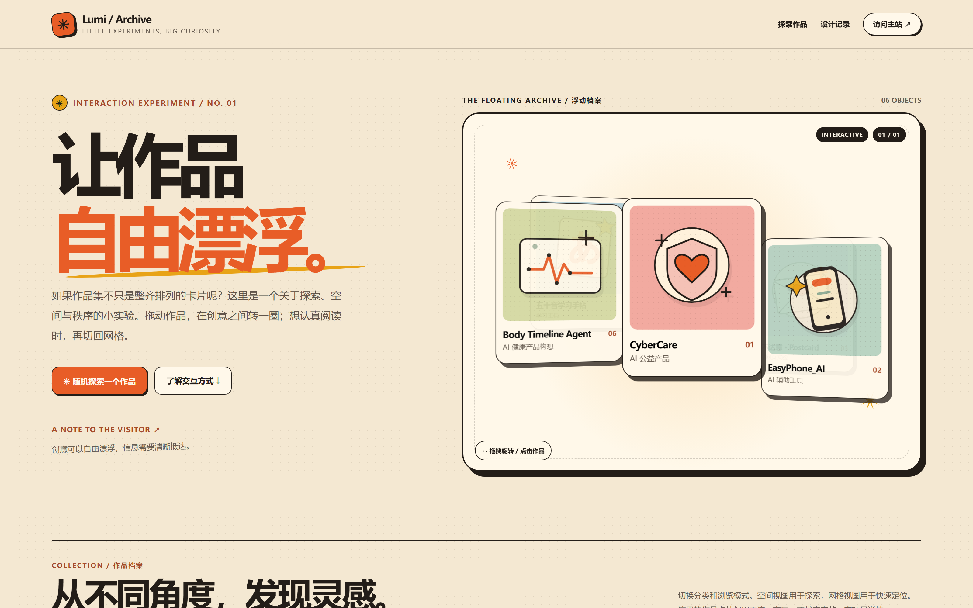
图:实验首屏的真实状态。右侧的浮动档案里,六张卡片绕中心分布、带前后层次,可拖拽旋转,也可点击查看详情。
01. 从一些漂亮的网站开始
最近一段时间,我陆陆续续收藏了很多前端设计网站。
有的专门展示优秀的 Landing Page,有的收集 UI 动效,有的提供字体、插画、配色,也有一些网站会直接提供组件源码和可以交给 AI 编程工具的提示词。
例如:
- Mobbin:研究真实产品的界面和用户流程。
- Landbook:观察不同网站的布局与视觉语言。
- React Bits:体验各种可以复用的前端动效组件。
- MotionSites:研究如何通过提示词实现具有表现力的网页。
- The Shape of AI:理解 AI 产品中人与智能体的交互模式。
一开始,我只是觉得这些网站很漂亮、很有趣。
看见喜欢的配色,就想保存下来;看到一个很流畅的动画,就想知道它是怎么实现的;遇到布局特别的网站,也会忍不住多停留一会儿。
但收藏得越多,我越发现一个问题:
我好像知道了很多网站,却不一定真正理解了它们的设计。
比如,我可以说一个页面很有高级感,却说不清这种感觉来自哪里。
是字体?留白?构图?颜色?还是那些几乎察觉不到的动画?
而且,就算我知道这个页面很好看,也不代表它适合我正在做的产品。
于是,我开始尝试用更具体的方式观察这些设计。
02. 从“好看”到“为什么这样设计”
在这个过程中,我逐渐认识了一些以前不太熟悉的设计概念。
例如,网页并不是只有从上到下排列内容这一种方式。
Hero Section、Bento Grid、Masonry、Split Screen、Magazine Layout……
原来很多看起来很有创意的布局,都有相对成熟的设计模式。
学习这些概念以后,我发现自己在使用 AI 辅助开发时,也能更准确地表达想法。
以前可能会说:
“帮我把页面做得更丰富一点。”
现在可以具体描述:
“首屏采用 Hero Section,作品区域使用不对称 Bento Grid,文章内容采用 Magazine Layout,手机端重新组织信息层级。”
同样,动效也不只是“让元素动起来”。
它需要考虑触发条件、持续时间、缓动曲线、运动方向,以及用户是否能够理解变化前后的状态。
这让我开始意识到:
设计不只是决定一个东西长什么样,还要决定它如何工作,以及人们如何理解它。
一个动画可以很好看,但如果让用户找不到按钮,它可能就不是一个好的产品交互。
03. 一个让我停下来的作品集
后来,我看到 MotionSites 上的一个案例:
这是一个以自然摄影为主题的作品集设计。
最吸引我的地方,不是它的摄影题材,而是它尝试将作品组织在具有空间感的界面里。
作品不再只是整齐排列的图片,而是可以围绕一个空间结构展示,用户能够通过交互改变观看角度。
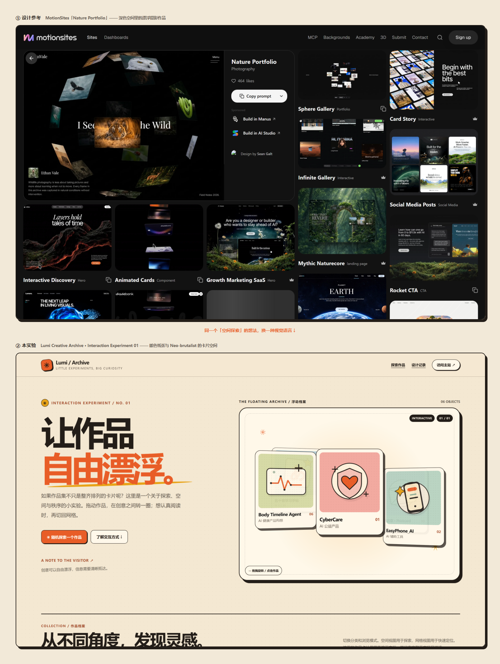
图:上为 MotionSites 的 Nature Portfolio 参考页面,下为这次实验最终的桌面首屏。同一个「空间探索」的想法,长成了两种视觉语言。
这让我产生了一个想法:
如果作品集不只是整齐排列的卡片呢?
我们习惯了通过列表、网格、分类来浏览内容。这些方法非常有效,但也很容易让浏览变成一种机械的筛选行为。
有没有可能让发现作品的过程本身也变得有趣?
比如让卡片漂浮起来,让用户主动旋转、探索、选择。
不过,我很快又想到另一个问题。
如果所有作品都放进一个复杂的空间里,对于只想快速找到某个项目的人来说,会不会反而更麻烦?
特别是对于招聘方,他们可能只想在很短的时间里了解我做过什么、项目解决了什么问题。
我不希望为了视觉效果牺牲信息效率。
所以,我决定做一个小实验。
04. Lumi Creative Archive:让作品自由漂浮
我把这个实验命名为:
Lumi Creative Archive · 交互实验 01
它不是一个正式的作品集改版,而是独立的 HTML 交互原型。
我希望保留现有个人网站的视觉气质:暖橘色、浅米色纸张背景、清晰的深色边框,以及一点随性、有趣的感觉。
与此同时,加入一种不同于常规作品列表的浏览方式。
最终,实验围绕一个简单的想法展开:
空间探索 + 网格浏览。
空间探索:让发现作品变得有趣
在空间模式下,作品卡片围绕中心分布,形成具有前后层次的视觉结构。
用户可以通过鼠标拖动改变卡片的位置,也可以使用键盘方向键调整视角。
点击卡片,可以查看对应的作品信息。
这种方式想表达的不是高效查找,而是探索。
我希望用户进入页面时,能够产生一点好奇心,愿意主动去看看周围还有什么。
网格浏览:给效率留一条退路
但我不希望用户必须接受这种浏览方式。
所以实验中保留了普通网格模式。
当用户想认真浏览作品时,可以切换到更清晰的卡片布局,按照分类查看不同内容。
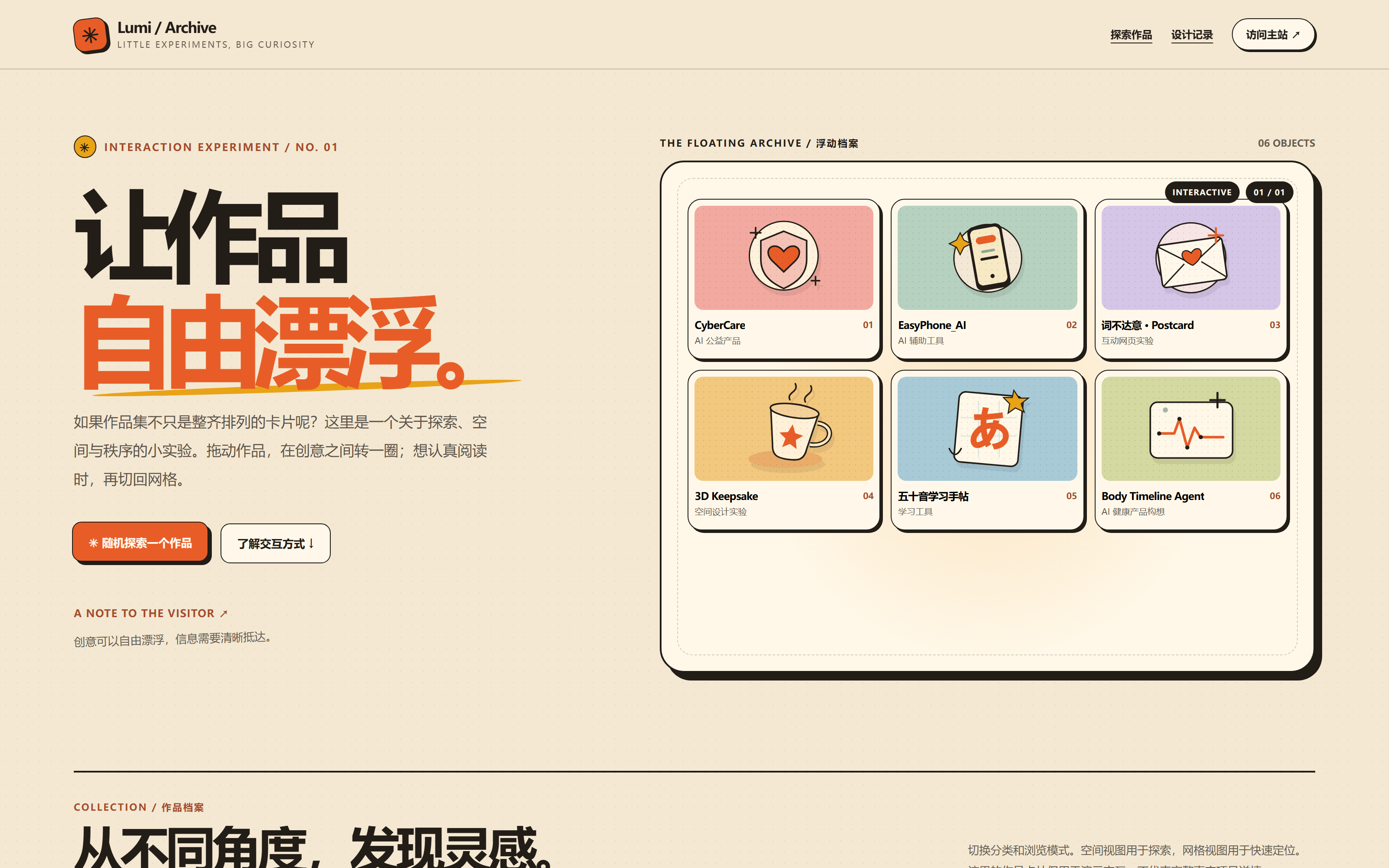
图:和封面同一个位置,切换到网格浏览之后的样子。空间模式负责探索,网格模式负责快速定位。
在手机端,页面默认使用网格浏览,同时保留主动切换空间模式的入口。
这其实是整个实验里我最喜欢的一项设计决策。
有趣和好用并不是非此即彼。我们可以让探索有趣,同时让信息清晰抵达。
作品不是孤立的图片
实验中还加入了几个交互细节:
- 根据项目类型筛选内容。
- 随机发现一个作品。
- 点击卡片进入详情。
- 在详情中继续浏览下一件作品。
- 为不同屏幕尺寸提供不同布局。
目前放入了 CyberCare、EasyPhone_AI、互动明信片、3D 实验和学习手帖等六张示例卡片。
它们用于验证不同内容是否能够在同一个视觉体系中展示,还不是完整的项目案例数据库。
现在,这个实验已经作为第 11 个实验接入 Lumi Lab,你可以在实验页面亲手拖一拖它。目前放进来的仍然是演示示例,正式的项目内容、Demo 和案例文章还需要逐步接入。
05. 为什么这次没有使用复杂的 3D 框架?
这个问题其实很有意思。
因为一开始看到参考网站时,我很自然地联想到 Three.js、Spline,以及各种 3D 交互框架。
但是当我们开始明确需求后,发现第一版并不需要真正的 WebGL 三维场景。
这次想验证的核心问题是:
用户是否喜欢这种空间浏览方式?它能否与普通网格共存?
因此,第一版采用原生 HTML、CSS 和 JavaScript,通过 CSS 透视、三维变换和指针事件,实现具有空间感的卡片交互。
没有额外安装大型前端框架。
这让我重新思考了一个以前容易忽略的问题:
技术复杂度和产品价值,并不总是正相关的。
有时候,一个视觉上很复杂的效果,不一定需要同样复杂的技术实现。
当然,这并不意味着原生实现永远更好。
如果后续需要真正的三维空间、复杂相机控制、物理效果或大量对象渲染,那么引入成熟的 3D 引擎可能更加合理。
但在这个阶段,先用相对简单的方案验证想法,是一个更合适的选择。
06. AI 可以帮我写代码,但设计判断仍然需要自己做
这次原型的技术实现主要借助 AI 工具完成。
我没有独立手写整个交互系统,而是通过讨论、提出需求、确定视觉方向和约束条件,让 AI 帮助生成并调整代码。
对我来说,这也是一次 AI 辅助开发工作流的练习。
过去我可能更关注最终能否生成一个网页。
现在我开始有意识地把过程拆成几个问题:
第一,这个设计想解决什么问题?
第二,有没有成熟的交互模式可以参考?
第三,哪些内容是必须保留的,哪些只是视觉装饰?
第四,应该使用什么技术实现,是否真的需要引入额外依赖?
第五,生成完成后,如何判断它是否真正可用?
在调试过程中,我们也遇到了空间卡片拖拽与点击事件之间的冲突。
这种细节很容易在视觉展示中被忽略。
一个页面看起来有可点击的卡片,并不代表用户真的能顺利点击。
因此,除了观察页面效果,还需要验证交互行为本身。
这一点让我更加确定,AI Coding 不是生成代码之后就可以结束。
能运行、能交互、能正确响应用户操作,和看起来像一个完整产品,是两回事。
07. 手机端不应该只是桌面端的缩小版
在研究这些设计网站时,我还发现自己越来越关注移动端。
很多创意网页在大屏幕上非常漂亮,但到了手机上,体验可能会完全不同。
例如空间作品展示,在桌面上可以依靠鼠标进行旋转和选择,但移动端存在不同的触摸操作、屏幕空间与性能限制。
所以,这次原型没有要求手机端完全复刻桌面布局,而是默认展示更容易操作的网格模式。
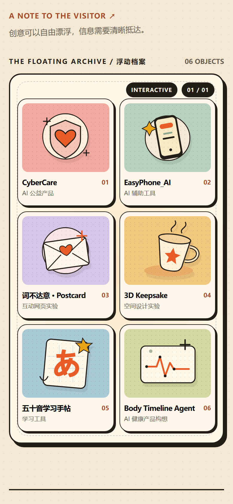
图:手机端(390×844 视口)打开页面后默认进入网格浏览,一屏可以看到全部六张卡片,也保留了切换空间模式的入口。
另外,实验也加入了键盘入口、焦点样式,以及对系统减少动态效果设置的基础支持。
这并不意味着它已经达到了完整的无障碍或性能验收标准。
但至少提醒我:
响应式设计不只是让元素适应屏幕大小,更应该让交互方式适应不同设备和使用情境。
即使现在已经在 Lumi Lab 上线,接下来仍需要进一步进行不同设备的触摸测试、性能检测、可访问性检查和真实用户体验验证。
08. 一个小实验,带来的几种新认识
回过头来看,这个 HTML 其实并不复杂,也没有实现什么全新的技术。
但是在制作它的过程中,我获得了几个比视觉效果更重要的认识。
第一,设计灵感需要经过自己的理解
看到优秀的作品,最有价值的不是复制它的外观,而是分析它为什么采用这样的设计。
Nature Portfolio 给我的启发是空间探索,而不是必须使用黑色背景、摄影主题或完全相同的交互结构。
真正值得借鉴的,是设计思路。
第二,设计需要有取舍
并不是每一个区域都需要动画,也不是每一个页面都适合使用 3D。
有时候,保持清晰的排版、良好的字体层级和明确的操作反馈,远比增加一个复杂特效重要。
第三,交互设计要允许不同的使用方式
有人喜欢探索,有人追求效率。
同一个产品可以为不同需求提供不同入口,而不是强迫每个人按照设计师想象中的方式操作。
第四,组件和设计规范应该逐渐积累
如果每做一个页面都重新选择字体、颜色、组件和动画,就很难形成稳定的视觉语言。
所以我也开始思考,是否应该为自己的个人网站建立一套更系统的 Design System。
它不需要一开始就很复杂。
也许先从颜色、排版、布局、按钮、卡片和动效规则开始,就已经能够明显改善后续的开发体验。
09. 让作品自由漂浮,也让想法慢慢落地
我一直觉得,个人网站不应该只是一个静态的自我介绍页面。
它也可以是一个展示思考、记录尝试和保存不成熟想法的地方。
有些实验可能最终会成为完整的产品,有些可能只停留在一个 HTML 页面。
但它们都有记录的意义。
这次的空间作品集,也不一定会直接成为个人网站的最终形态。
也许经过更多测试,我会发现它更适合作为一个独立的创意实验,而不是网站的主要导航方式。
这也没有关系。
因为这次真正想验证的,不是我能不能做出一个漂浮的作品墙。
而是:
当我遇到一个喜欢的设计时,能不能从“它真好看”,继续走到“我想理解它,并试着做出自己的版本”。
我想,这也是我最近持续学习前端设计、UI/UX 和 AI 辅助开发的原因之一。
我不只是想做出一个漂亮的网站。
我更想慢慢学会,如何把一个模糊的想法,变成别人真正可以看到、触碰和体验的东西。
而这次,就先从让几张卡片自由漂浮开始。
关于本实验
- 项目:Lumi Creative Archive · Interaction Experiment 01
- 形式:独立 HTML / CSS / JavaScript 交互原型
- 参考启发:MotionSites 的 Nature Portfolio
- 视觉方向:暖橘色、纸张质感、Neo-brutalist
- 核心交互:空间探索、网格浏览、分类筛选、作品详情
- 开发方式:AI 辅助实现、交互测试与迭代
- 当前阶段:已作为第 11 个实验接入 Lumi Lab(实验页面),卡片内容仍为演示示例
一个关于设计、探索与创造的小实验。
When I stopped being satisfied with collecting beautiful websites and started thinking about how to make web pages interesting.
The real first screen of the experiment. On the right, six cards orbit the center with a sense of depth — draggable, and clickable for details.
01. It Started With a Few Beautiful Websites
Over the past while, I had been collecting a lot of frontend design websites.
Some showcase excellent landing pages, some collect UI motion effects, some provide fonts, illustrations, and color palettes, and some offer component source code together with prompts ready to hand to AI coding tools.
For example:
- Mobbin: studying real product interfaces and user flows.
- Landbook: observing the layouts and visual language of different websites.
- React Bits: experiencing reusable frontend animation components.
- MotionSites: studying how to build expressive web pages through prompts.
- The Shape of AI: understanding interaction patterns between people and AI in AI products.
At first, I simply found these websites beautiful and interesting.
When I saw a color palette I liked, I wanted to save it; when I saw a smooth animation, I wanted to know how it was made; when I came across an unusually laid-out website, I couldn’t help staying a little longer.
But the more I collected, the more I noticed a problem:
I seemed to know a lot of websites, without truly understanding their design.
For example, I could say a page felt refined, but couldn’t explain where that feeling came from.
The type? The whitespace? The composition? The color? Or those animations that are almost invisible?
And even if I knew a page looked good, that didn’t mean it suited the product I was building.
So I started trying to observe these designs in a more concrete way.
02. From “It Looks Good” to “Why Is It Designed This Way”
In this process, I gradually came to know some design concepts I hadn’t been familiar with before.
For example, a web page doesn’t have to be a top-to-bottom stack of content.
Hero Section, Bento Grid, Masonry, Split Screen, Magazine Layout……
It turned out that many seemingly creative layouts have mature, well-established design patterns behind them.
After learning these concepts, I found I could also express my ideas more precisely when working with AI-assisted development.
I used to say things like:
“Help me make the page feel richer.”
Now I can describe it concretely:
“Use a Hero Section for the first screen, an asymmetric Bento Grid for the works area, a Magazine Layout for articles, and reorganize the information hierarchy for mobile.”
Similarly, motion is not just “making elements move.”
It has to consider trigger conditions, duration, easing curves, direction of movement, and whether users can understand the state before and after the change.
This made me realize:
Design is not only about deciding what something looks like, but also about deciding how it works, and how people understand it.
An animation can be beautiful, but if it leaves users unable to find the button, it may not be good product interaction.
03. A Portfolio That Made Me Stop
Later, I came across a case on MotionSites:
It is a portfolio design themed around nature photography.
What drew me in most wasn’t the photography subject, but its attempt to organize works inside an interface with a sense of space.
The works were no longer just neatly arranged images; they were displayed around a spatial structure, and users could change the viewing angle through interaction.
Nature Portfolio on MotionSites above, the final desktop first screen of this experiment below. The same idea of “spatial exploration” grew into two different visual languages.
That sparked an idea:
What if a portfolio wasn’t a neat grid of cards?
We are used to browsing content through lists, grids, and categories. These methods work very well, but they can easily turn browsing into a mechanical act of filtering.
Could the process of discovering work itself become interesting?
Say, letting the cards float, letting users rotate, explore, and choose on their own.
But I quickly thought of another question.
If all the works went into one complex space, wouldn’t it be more troublesome for someone who just wants to quickly find a specific project?
Especially for recruiters, who may only have a short time to learn what I’ve made and what problems my projects solve.
I didn’t want to sacrifice information efficiency for visual effects.
So I decided to run a small experiment.
04. Lumi Creative Archive: Letting Works Float Freely
I named this experiment:
Lumi Creative Archive · Interaction Experiment 01
It is not a formal portfolio redesign, but a standalone HTML interaction prototype.
I wanted to keep the visual character of my existing personal website: warm orange, a light beige paper background, clear dark borders, and a bit of playfulness.
At the same time, I wanted to add a browsing style different from the usual list of works.
In the end, the experiment was built around one simple idea:
Spatial exploration + grid browsing.
Spatial Exploration: Making Discovery Fun
In spatial mode, the work cards are distributed around a center, forming a visual structure with depth.
Users can drag with the mouse to change how the cards sit, and can also use the arrow keys to adjust the view.
Clicking a card opens the corresponding work’s details.
What this mode wants to express is not efficient searching, but exploration.
I hope that when users enter the page, they feel a bit of curiosity and are willing to look around to see what else is there.
Grid Browsing: Leaving an Exit for Efficiency
But I didn’t want users to have to accept this browsing style.
So the experiment keeps an ordinary grid mode.
When users want to browse seriously, they can switch to a clearer card layout and view different content by category.
The same place as the cover, after switching to grid browsing. Spatial mode is for exploring; grid mode is for finding things fast.
On mobile, the page uses grid browsing by default, while keeping an entry for actively switching to spatial mode.
This is actually my favorite design decision in the whole experiment.
Interesting and usable are not either-or. We can make exploration fun while letting information arrive clearly.
Works Are Not Isolated Images
The experiment also includes a few interaction details:
- Filtering content by project type.
- Randomly discovering a work.
- Clicking a card to open its details.
- Continuing to the next work from the details.
- Providing different layouts for different screen sizes.
For now, it contains six sample cards: CyberCare, EasyPhone_AI, an interactive postcard, a 3D experiment, and a learning notebook.
They exist to verify whether different kinds of content can live in the same visual system; they are not a complete project case database yet.
The experiment has now been integrated into Lumi Lab as its eleventh experiment — you can try dragging it on the experiment page. The cards are still demo samples for now; real project content, demos, and case articles still need to be added step by step.
05. Why Didn’t I Use a Complex 3D Framework This Time?
This question is actually interesting.
Because when I first saw the reference site, I naturally thought of Three.js, Spline, and all kinds of 3D interaction frameworks.
But once we started clarifying requirements, we found the first version didn’t need a real WebGL 3D scene at all.
The core question this experiment wanted to verify was:
Do users enjoy this spatial browsing style? Can it coexist with an ordinary grid?
So the first version uses native HTML, CSS, and JavaScript, building the spatial card interaction with CSS perspective, 3D transforms, and pointer events.
No large frontend framework was installed.
This made me rethink something I used to overlook:
Technical complexity and product value are not always positively correlated.
Sometimes a visually complex effect doesn’t require an equally complex technical implementation.
Of course, this doesn’t mean native implementation is always better.
If the follow-up needs real 3D space, complex camera control, physics effects, or rendering large numbers of objects, then bringing in a mature 3D engine would make more sense.
But at this stage, validating the idea with a relatively simple solution was the more fitting choice.
06. AI Can Write My Code, but the Design Judgment Is Still Mine
The technical implementation of this prototype was done mainly with AI tools.
I didn’t hand-write the whole interaction system by myself; instead, through discussion, stating requirements, and setting the visual direction and constraints, I had AI generate and adjust the code.
For me, this was also a practice run of an AI-assisted development workflow.
I used to care mostly about whether a web page could be generated in the end.
Now I consciously break the process into several questions:
First, what problem is this design trying to solve?
Second, are there mature interaction patterns to reference?
Third, which parts are must-keep, and which are just visual decoration?
Fourth, what technology should implement it — is an extra dependency really needed?
Fifth, once it’s generated, how do I judge whether it actually works?
During debugging, we also ran into a conflict between dragging the spatial cards and click events.
Details like this are easy to overlook in a visual showcase.
A page that looks like it has clickable cards doesn’t mean users can actually click them smoothly.
So beyond watching how the page looks, the interaction behavior itself needs to be verified.
This made me more certain: AI Coding doesn’t end when the code is generated.
Running, interacting, and responding correctly to user actions — that is a different thing from looking like a finished product.
07. Mobile Should Not Be a Shrunken Desktop
While studying these design websites, I also noticed I was paying more and more attention to mobile.
Many creative web pages look great on big screens, but the experience can be completely different on a phone.
For example, a spatial work display can rely on the mouse for rotating and selecting on desktop, but mobile has different touch operations, screen space, and performance limits.
So this prototype didn’t ask mobile to replicate the desktop layout; it shows the easier-to-operate grid mode by default.
On a phone (390×844 viewport), the page opens in grid browsing by default — all six cards fit in one screen, with the entry to spatial mode still available.
The experiment also adds keyboard entry, focus styles, and basic support for the system’s reduced-motion setting.
That doesn’t mean it has already met full accessibility or performance acceptance standards.
But it reminds me:
Responsive design is not just about making elements fit the screen size; it should make the way of interacting fit different devices and contexts.
Even though it is now live on Lumi Lab, it still needs further touch testing on different devices, performance checks, accessibility review, and validation with real users.
08. A Few New Understandings From a Small Experiment
Looking back, this HTML isn’t complicated, and it doesn’t implement any brand-new technology.
But making it gave me several understandings more important than the visual effects.
First, design inspiration needs to pass through your own understanding
With excellent work, the most valuable thing isn’t copying its appearance, but analyzing why it is designed this way.
What Nature Portfolio gave me was the idea of spatial exploration — not a requirement to use a dark background, a photography theme, or the exact same interaction structure.
What’s truly worth borrowing is the design thinking.
Second, design requires trade-offs
Not every area needs animation, and not every page suits 3D.
Sometimes keeping clear typography, a good type hierarchy, and explicit interaction feedback matters far more than adding one more complex effect.
Third, interaction design should allow different ways of using it
Some people like to explore; some pursue efficiency.
The same product can offer different entries for different needs, instead of forcing everyone to operate the way the designer imagined.
Fourth, components and design standards should accumulate over time
If every new page means re-choosing fonts, colors, components, and animations, it’s hard to form a stable visual language.
So I’ve also started thinking about whether I should build a more systematic Design System for my personal website.
It doesn’t need to be complicated at the start.
Perhaps beginning with color, typography, layout, buttons, cards, and motion rules would already noticeably improve the development experience that follows.
09. Let Works Float Freely, and Let Ideas Land Slowly
I’ve always felt a personal website shouldn’t be just a static self-introduction page.
It can also be a place to show thinking, record attempts, and keep immature ideas.
Some experiments may eventually become complete products; some may stay a single HTML page.
But they all have the value of being recorded.
This spatial portfolio may not become the final form of my personal website either.
Maybe after more testing, I’ll find it works better as a standalone creative experiment than as the site’s main navigation.
That would be fine too.
Because what this experiment really wanted to verify was not whether I could make a floating wall of works.
It was:
When I encounter a design I like, can I go from “it looks great” to “I want to understand it, and try to make my own version”?
I think that’s also one of the reasons I’ve been continuously learning frontend design, UI/UX, and AI-assisted development lately.
I don’t just want to make a beautiful website.
I want to slowly learn how to turn a vague idea into something others can actually see, touch, and experience.
And this time, it starts with letting a few cards float freely.
About this experiment
- Project: Lumi Creative Archive · Interaction Experiment 01
- Form: standalone HTML / CSS / JavaScript interaction prototype
- Reference: Nature Portfolio on MotionSites
- Visual direction: warm orange, paper texture, Neo-brutalist
- Core interactions: spatial exploration, grid browsing, category filters, work details
- Development: AI-assisted implementation, interaction testing and iteration
- Status: integrated into Lumi Lab as the eleventh experiment (experiment page); card content still demo samples
A small experiment about design, exploration, and creation.